
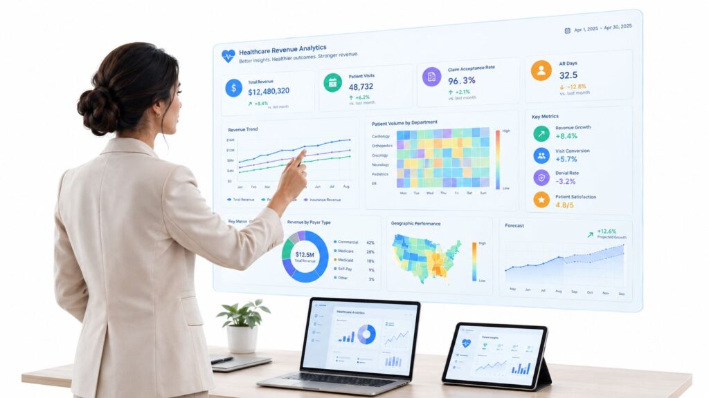
At 7:45 a.m., the revenue team doesn't need another spreadsheet. They need one screen that tells them what changed overnight, which payer is slipping, where underpayments are stacking up, and which claims are worth immediate escalation. In a multi-site specialty group, that morning readout often decides whether the day is spent moving cash or just talking about it.
That's where a healthcare analytics dashboard earns its keep. Not as a prettier report. Not as an executive scorecard no one opens after month-end. The useful version sits in the middle of operations, between claims submission, remittance posting, denial follow-up, and IDR preparation. It turns fragmented transaction data into work the team can assign before the first coffee refill.
The difference matters more now because healthcare analytics has become a large and expanding category. Industry estimates value the market at USD 56.22 billion in 2025 and project growth from USD 69.74 billion in 2026 to USD 213.27 billion by 2031, with a 25.1% CAGR. The same analysis notes that descriptive analytics held 45.87% share in 2025, software represented 59.40%, and North America accounted for 43.76% of regional share. For providers, that reinforces something revenue teams already know. Dashboard-style reporting is still the front line of decision-making because it's where leaders and staff consume operational metrics (healthcare analytics market analysis).
What a Healthcare Analytics Dashboard Actually Does
In a healthy revenue standup, the director opens one view and the room gets answers in under five minutes. Denial aging by payer. IDR candidates waiting on documentation. Underpayment alerts tied to specific CPT and site combinations. A site-level drift in point-of-service collections. Owners get assigned, not because the dashboard is flashy, but because it narrows the day to what needs action now.

A healthcare analytics dashboard is the decision layer that fuses operational, financial, and often clinical context into a usable workspace. For revenue teams, that usually means it sits between the practice management system, the EHR, clearinghouse feeds, remittance data, eligibility transactions, and payer portal extracts. It should surface only the signals that change work. A spike in downcoded anesthesia claims matters. A payer whose arbitration timeline keeps slipping matters. A trend line with no next step usually doesn't.
What it is and what it isn't
The dashboard isn't just a BI tab for executives. It isn't clinical decision support. It isn't an EHR report bundle with twenty filters and no ownership. Teams adopt dashboards when the tool is embedded in actual workflow, with governance, customization, security, and ongoing evaluation behind it. That pattern shows up in health-system dashboard research and in public-sector use, where organizations like the CDC publish provider- and facility-level dashboards as a standard way to monitor large healthcare datasets over time (dashboard adoption and workflow integration research).
A dashboard fails when people have to leave it to decide what to do next.
The revenue version has four jobs.
- Monitor: Track current state across denials, aging, cash posting, underpayments, and dispute queues.
- Detect: Flag unusual payer behavior, coding drift, missed filing risk, or timing failures before month-end.
- Prioritize: Rank work so analysts focus on claims with recoverable value, not just the oldest bucket.
- Audit: Preserve the metric logic, source traceability, and user activity needed for compliance and appeals.
What works in practice
The dashboards that stick are almost always narrower than leaders expect. They don't try to answer every question for every audience on day one. They answer the same recurring operational questions reliably.
In RCM and IDR contexts, the highest-value screen usually combines three views: open risk, recoverable opportunity, and blocked claims. That blend keeps the team from over-indexing on volume while missing high-value underpayments or submission defects that will turn into avoidable disputes later.
Core Components and Data Architecture
Most dashboard failures start upstream. Teams spend weeks debating chart types when the issue is that the source logic for allowed amount, expected reimbursement, or denial category was never normalized. If the semantic layer is weak, the dashboard becomes a meeting artifact instead of an operating system.
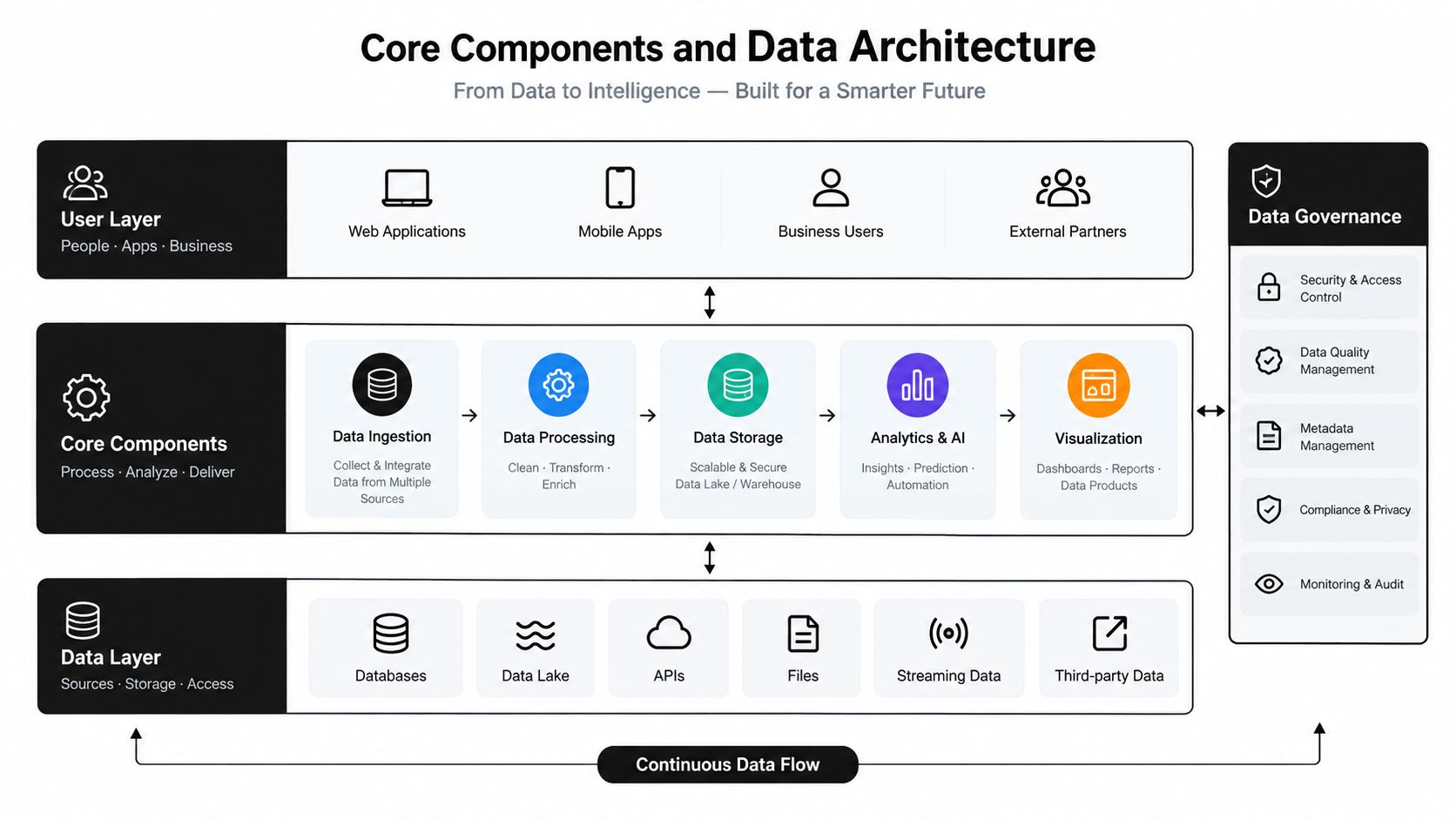
Layer one brings in the source systems
For specialty revenue teams, the raw inputs are familiar:
- Claims and encounters: PM and EHR claim records, charge detail, modifiers, rendering provider, and site-of-service data.
- Adjudication feeds: 835 remittances, 277CA acknowledgments, clearinghouse rejections, and payer portal status updates.
- Eligibility and credentialing: Coverage checks, authorization status, provider participation, and site-specific payer enrollment details.
- Contract and fee logic: Contract terms, carve-outs, usual allowed patterns, and reimbursement rules by payer and product.
In multi-site groups, local variation starts hurting. One site uses a custom denial bucket. Another maps technical and professional components differently. A third stores payer class in a free-text field. The dashboard can't fix that by itself.
Layer two creates the metric logic
This layer matters more than the front end. Before a single chart is built, each KPI should have an explicit numerator, denominator, exclusions, refresh cadence, and named owner. That's the only reliable way to prevent finance, operations, and billing from showing different numbers in the same meeting. It also makes the dashboard auditable, which matters when revenue teams use the same governed data downstream for appeals and dispute work (KPI governance guidance for healthcare dashboards).
Practical rule: If two managers can define “underpayment” differently, the dashboard isn't ready for production.
A solid metric layer usually normalizes raw events into concepts such as expected reimbursement, contractual adjustment, payment variance, payer turnaround behavior, denial severity, and case-readiness status. If you want a good overview of how organizations think about this broader revenue data structure, healthcare revenue cycle analytics is the right frame.
Layer three should mirror team jobs
A revenue dashboard doesn't need more charts. It needs more usable work queues.
Examples that work well:
- Aging worklists sorted by recoverability, not just age.
- Denial reason trees that let supervisors move from payer to code family to site to user.
- Underpayment heat maps by payer and CPT or service line.
- IDR readiness queues that show whether documentation, remits, and contract logic are complete.
Layer four controls access and traceability
HIPAA, internal controls, and operating discipline meet. Use role-based views, row-level security, export restrictions, and query logs. Keep patient-level identifiers limited to users who need them. Everyone else should work from aggregated metrics or masked detail.
There's also a cost trade-off here. Real-time data sounds appealing, but teams pay for freshness. In some environments, near-real-time feeds are worth it for work queue routing. In others, scheduled batch ETL is enough and much cheaper to maintain. Recent healthcare BI coverage points to rising demand for real-time dashboards, AI-augmented analytics, and self-service BI, while also stressing that value depends on freshness, normalization, interoperability, and workflow integration rather than chart design alone (healthcare BI trends report).
Specialty-Specific KPIs Across Complex Practices
A generic dashboard usually collapses the moment a specialty asks a real question. Orthopedics wants to know where bundle variance is leaking margin. Anesthesia wants concurrency denial patterns by payer. Air ambulance wants disputed mileage logic and reasonableness challenges. Same platform, different operating reality.
What belongs on the first screen
The first screen should answer, “Where are we losing revenue today?” That answer changes by specialty.
| Specialty | First-Screen KPIs | Early-Warning Metric |
|---|---|---|
| IONM | Professional vs. technical split, neuromonitoring time capture, coder accuracy by neurodiagnostic case type | Rising uncoded or partially documented monitoring cases |
| Anesthesia | ASA distribution, time-unit capture, concurrency denial volume by payer | Drift between scheduled case time and billed time units |
| Orthopedics | Implant pass-through capture, ASC vs. HOPD site-of-service mix, bundle variance | Increase in implants or supplies posted without matched charge logic |
| Cardiology | Diagnostic cath denial patterns, device underpayment review queue, observation vs. inpatient status mix | Growth in cases with documentation mismatched to status or device billing |
| Radiology | Modality mix, prior authorization yield, appropriateness-related exception queue | Climb in scheduled studies missing authorization or clinical support |
| ASC | Transfer-to-HOPD rate, supply charge capture, payer carve-out tracking | Increase in cases closed with missing carve-out handling |
| Air ambulance | Flight leg reimbursement, mileage dispute queue, payment reasonableness denials | Growing backlog of claims with incomplete transport evidence |
Why specialty logic changes dashboard design
Specialties don't just need different KPIs. They need different relationships between data elements. In anesthesia, time capture, modifier logic, and concurrency behavior interact. In IONM, the professional and technical split can distort follow-up if the dashboard doesn't separate them cleanly. In radiology, authorization yield matters upstream because by the time a denial posts, the recoverability path is already narrower.
That's why benchmarking should be done carefully. Cross-site comparison is useful only when metric definitions match. Otherwise, leaders end up comparing workflow habits instead of performance. For teams trying to standardize those comparisons, performance benchmarking for healthcare revenue operations is often the more relevant exercise than adding another screen.
The first screen shouldn't be the most impressive one. It should be the one supervisors actually use before assigning work.
One mistake that shows up repeatedly
Many groups overload the landing page with executive metrics and bury the specialty leak points two clicks deep. That's backward. Executives can consume summaries later. Frontline users need the operational levers first, because those are the metrics that prevent downstream write-offs and weak dispute files.
Connecting RCM Metrics to IDR Workflows
RCM and IDR often get reported as separate functions. On the ground, they're one decision chain. The same adjudication event that lands in a denial work queue may also signal an underpayment pattern, a payer behavior issue, or a case that belongs in a dispute pipeline once documentation is confirmed.
The handoff should happen inside one governed flow
A clean setup works like this. Claim adjudication updates the RCM layer. The dashboard checks that event against payment variance rules, denial categories, timeliness windows, and service-line logic. If the claim meets internal dispute criteria, it moves into an IDR-eligible queue with required documents attached or flagged as missing.
That handoff matters because it prevents a common failure mode: filing a dispute on a claim the team hasn't fully substantiated. If the payment variance looks suspicious but the operative note, payer response, remit details, or eligibility proof aren't tied to the same governed dataset, the case leaves the dashboard weak.
A practical mapping model
Use dashboard thresholds as routing rules, not as legal conclusions. The dashboard's job is to identify and prepare. Human review still decides whether the case should move.
| RCM Metric | Dashboard Threshold | IDR Trigger | Required Documentation |
|---|---|---|---|
| Denial aging | Aging beyond internal follow-up tolerance with no payer movement | Escalate to dispute-readiness review | Claim history, denial record, follow-up notes |
| Allowed amount variance | Payment materially below modeled expectation | Underpayment review and dispute screening | Contract terms or benchmark logic, remit, charge detail |
| Repeated denial code pattern | Same denial family recurring by payer and service type | Batch appeal or dispute prioritization | Denial trend view, coding support, supporting records |
| NSA case-readiness status | Eligible claim with complete evidence set | Move to formal IDR queue | Eligibility support, clinical documentation, payment record, correspondence |
| Documentation gap | Missing critical records after payment issue detected | Hold from submission until complete | Missing document checklist and owner |
A denial analytics framework helps here because not every denial belongs in the same pathway. Some are registration defects. Some are coding disputes. Some are underpayments masquerading as administrative denials. Teams that separate those paths earlier usually waste less analyst time. Denial management analytics is the right operational lens for that split.
If the dashboard can't tell you why a case is in the queue and what evidence is still missing, it isn't connecting RCM to IDR. It's just forwarding noise.
What keeps the chain auditable
Every transition needs a timestamp, owner, and evidence state. That includes when the payment issue was detected, who reviewed it, what rule routed it, and what documentation was attached before the next step. Dashboard discipline protects both compliance and recoverable revenue.
HIPAA, Data Governance, and Access Design
Governance isn't a footer item. It's part of the product design. If a healthcare analytics dashboard exposes more PHI than the user needs, allows unmanaged exports, or leaves no audit trail, it creates operational risk even if the visualizations are otherwise excellent.
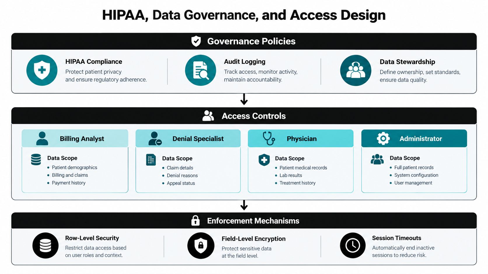
Access should follow job function
Different roles need different slices of the same truth.
- Billing analysts need claim-level detail, aging status, payer response history, and work queue ownership.
- Denial specialists need denial families, root-cause drilldowns, supporting attachments, and appeal deadlines.
- Compliance officers need visibility into access patterns, exports, and policy exceptions.
- Executives usually need aggregate trends, not patient-level records.
That means role-based access has to be built into the warehouse and the dashboard layer. Don't rely on user behavior alone. Enforce row-level security for site, specialty, or business unit, and mask fields that aren't required for the task.
Minimum necessary should be technical, not aspirational
Treat PHI handling at the field level. Patient name, date of birth, subscriber identifiers, addresses, and full account numbers often don't belong in broad operational views. Aggregated metrics, payer trends, and queue-level summaries are safer for wider distribution. Shared screenshots for training should be de-identified by default, not manually redacted after the fact.
Useful controls include:
- Signed exports: Track who exported what, when, and for what role.
- Training environments: Use de-identified or synthetic data for onboarding.
- Session controls: Timeouts, re-authentication for sensitive views, and device restrictions where needed.
- Quarterly access reviews: Tie dashboard entitlements to employment status, credential rotation, and manager approval.
Auditability is part of usability
Revenue leaders sometimes resist tight controls because they worry it slows the team down. Bad controls do. Good controls don't. If the dashboard logs every query, records every export, and limits patient-level access to the users who need it, supervisors can move faster because they're not improvising governance every time someone needs a screenshot or escalation packet.
A well-controlled dashboard also reduces friction during internal review. When someone asks where a metric came from or who viewed a disputed account, the answer should already be in the system.
Implementation Roadmap from Pilot to Scale
Most dashboard rollouts fail for ordinary reasons. Definitions aren't settled. Local workflow exceptions become permanent architecture. Pilot users get trained on screens that still change every week. By the time leadership asks for cross-site comparison, every site is measuring something slightly different.
A tighter rollout is less glamorous and much more successful.
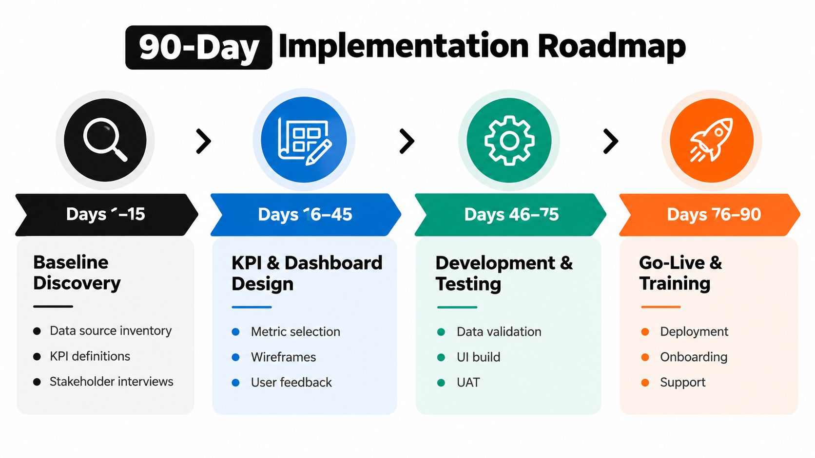
Days 1 through 15 establish the baseline
Start with source inventory, current KPI definitions, and stakeholder interviews. You're looking for mismatch. Which teams say they track denial rate but mean different things? Which sites use local spreadsheets as shadow systems? Which payer portal extracts matter because the PM system doesn't capture enough detail?
Artifacts to produce:
- Source-to-target map
- Current-state KPI inventory
- Stakeholder requirement log
Days 16 through 45 lock the metric layer
Canonical definitions get written and argued through. RCM-to-IDR linkage rules should be explicit. Historical denials and remits should be used to validate whether the proposed logic catches the right cases and excludes the wrong ones.
The essential deliverable is the metric dictionary. Skip it, and the dashboard turns political the first time two leaders compare numbers.
Build definitions before visuals. Teams can tolerate an ugly prototype. They won't tolerate numbers they don't trust.
Days 46 through 75 run a contained pilot
Use one specialty, one region, or one site cluster. Don't pilot across every service line at once. Train supervisors first, then frontline users. Keep a defect log. Track which alerts get ignored, which drill paths save time, and which fields users still have to hunt down outside the dashboard.
Pilot outputs should include:
- Pilot scorecard
- Defect and enhancement log
- Training record and access approvals
Days 76 through 90 move into steady state
By this point, the main questions are adoption, governance sign-off, and expansion order. Which views are getting used daily? Which exceptions still require manual handling? What should roll out next without breaking comparability across sites?
A steady-state review should end with a short backlog, not a giant wishlist. The strongest healthcare analytics dashboard programs scale because they protect the metric layer while expanding use cases carefully.
Measuring ROI and Recoverable Revenue
Revenue leaders always ask the same question eventually: what is the dashboard worth? The honest answer is that the dashboard itself doesn't create revenue. The workflow changes it enables do. If the system shortens denial resolution, surfaces underpayments earlier, and routes stronger dispute files faster, then the financial return shows up in cash timing, recoveries, and margin protection.
Three levers that matter
The first lever is denial cycle time. When supervisors can see aging by payer, denial family, and owner in one place, they usually intervene earlier. The second is underpayment recovery. Variance logic tied to remits and expected reimbursement helps teams spot patterns before they disappear into write-off behavior. The third is cash acceleration. Better prioritization changes which work gets touched first.
These are measurable internally, but the exact impact varies by specialty, payer mix, documentation quality, and appeal discipline. Without practice-specific baseline data, it's better to model scenarios than pretend there's a universal benchmark.
A workable ROI table
| Specialty | Primary KPI Lever | Baseline | Target After 6 Months | Assumed Revenue Impact |
|---|---|---|---|---|
| Anesthesia | Concurrency denial follow-up speed | Manual queue review and delayed escalation | Faster routing of payer-specific denial patterns | Earlier recovery of claims that would otherwise sit unresolved |
| Orthopedics | Bundle variance and implant underpayment visibility | Contract variance reviewed after close | Active review during the month | Reduced leakage from missed underpayment patterns |
| Cardiology | Device and status-related denial prioritization | Mixed queue with limited value scoring | Worklists sorted by recoverability and deadline | Better use of analyst time on higher-value cases |
| Radiology | Authorization and denial prevention feedback loop | Upstream issues found after denial posts | Faster feedback to scheduling and auth teams | Lower preventable leakage and cleaner resubmission path |
| ASC | Carve-out and site-of-service exception handling | Manual identification of carve-out issues | Rule-based queueing and escalation | Improved capture of payments tied to contract nuance |
| Air ambulance | Dispute-readiness screening | Case prep starts outside core RCM workflow | Governed queue with evidence status visible | Stronger recovery path on underpaid or disputed claims |
How to think about return without inventing precision
Use your own baseline for days to resolution, dollars written off after avoidable delay, volume of underpayment reviews, and number of dispute-eligible claims missing documentation at first touch. Then compare post-launch trend lines over a stable period.
A good dashboard should also produce softer but still important gains. Teams spend less time gathering data. They complete tasks faster, make fewer errors, and maintain better situation awareness when dashboards are designed well. Clinical and quality dashboard evidence has associated dashboard use with reduced cognitive load, shorter task-completion time, fewer errors, better compliance with evidence-based safety guidance, and, when accessible to clinicians, better adherence to care guidelines and improved patient outcomes (dashboard effects on workflow and compliance). In revenue operations, the equivalent benefit is operational clarity. Fewer hunts for data. Fewer stale queues. Fewer preventable misses.
Choosing and Building the Right Dashboard
A real revenue-protection dashboard separates itself from a reporting tool in five ways.
The five capabilities that matter
- Payer-behavior intelligence: It should show how adjudication patterns change by payer, plan, code family, and site.
- IDR-ready evidence packaging: Teams should know whether a case has the documents and logic needed for the next escalation step.
- Role-based HIPAA access: Users should see only what their work requires.
- Denial-to-cash traceability: Every issue should be traceable from submission through payment, follow-up, and final outcome.
- Practical refresh cadence: Daily is often enough. More frequent updates matter only if users can act on them.
Build or buy
If your organization already runs a mature data engineering function and has unusual specialty logic, a custom build can make sense. Most multi-site specialty groups, though, do better with a configurable platform that can ingest from the EHR, clearinghouse, remittance feeds, and contract data while still supporting governed metric definitions.
One option in this category is RevGuard, which combines specialty-focused RCM and IDR workflows with analytics layers for payer behavior, AR, denials, and dispute opportunities. The relevant question isn't brand preference. It's whether the tool can support your operating model without forcing your team back into spreadsheets.
A short evaluation checklist
Ask every vendor or internal build team the same questions:
- Can it model contract logic and payment variance clearly?
- Does it support audit logging for views, queries, and exports?
- Can screenshots and training views be de-identified by default?
- Does it trace a denial or underpayment from first signal to final cash outcome?
- Can it export documentation packets for appeals or dispute workflows?
- Will KPI definitions stay governed across sites and specialties?
If those answers are weak, the interface won't save the project. A healthcare analytics dashboard only becomes valuable when revenue teams trust the numbers, use the queues daily, and can move from signal to action without rebuilding the case outside the tool.
RevGuard helps specialty providers connect RCM operations and IDR execution inside one revenue-protection model, with dashboards built around denials, underpayments, payer behavior, and dispute-ready workflows. If your team is trying to stop revenue leakage instead of just reporting on it after the fact, visit RevGuard to see how that model fits multi-site specialty groups, ASCs, hospitals, and emergency service providers.